Why is Phoenix Logo Design Important?
Your logo is in many instances, a potential customer’s first point of contact with your brand. What will people think when they see your logo? Corporate? Food based? Humorous? Handmade or Organic?
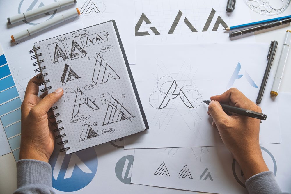
I have found it helpful to have my clients fill out my logo design worksheet before starting the Phoenix logo design process. It asks a series of questions such has who your competitors are, if there is a story behind your name, and types of colors you want to see, just as a few examples.
In addition to this, I also encourage a quick activity which is to find 3-5 logos you like and 3-5 logo designs that you do not. They do NOT have to do with your industry at all. I am simply looking for your sense of style and aesthetics which helps for me to see into your “creative window”. This activity in combination with my logo design worksheet gives me enough information to start my creative process on your new Phoenix Logo design.
Evolution or Revolution?
Do you have an existing logo design? If so, you may be faced with this question-are we doing a facelift or a complete logo design overhaul? If your brand has been around for 5 years or more, and if you have a strong brand recognition amongst your customer base, you may want to consider updating the logo rather then starting over. This could consist of color or typography updates. If you have any type of custom illustration (such as a tomato, or dog as an example) then perhaps that illustration could use an update or refresh.
For those of you who have a logo that was perhaps created very poorly or looks very outdated, a revolution is for you. As we talked about earlier, your logo is the first face that many new customers see, and you don’t want them thinking you are stuck in the past.
Remember: A logo is just one part of the pie
It’s easy to get hung up on your Phoenix logo design, and to want your logo to do a lot of heavy lifting. Your logo does NOT have to illustrate exactly what you do just by looking at it. Think about this, If Nike had a logo that was a picture of a shoe, that would have pigeon-holed them into ONLY making shoes. Sometimes going the more abstract or font-only route allows for you to expand in the future what your offerings are.
It’s important to remember that MOST of the time-if someone is looking at your logo, they are not looking at it alone on a blank sheet of paper. It’s ON something. Such as your website, a postcard or a business card. There is supporting images, text and graphics that help tell the story of your brand.
Ready to get to work? Call me at 623-476-7394 or schedule a consultation call here. Interested in Phoenix logo design rates? View them here.


