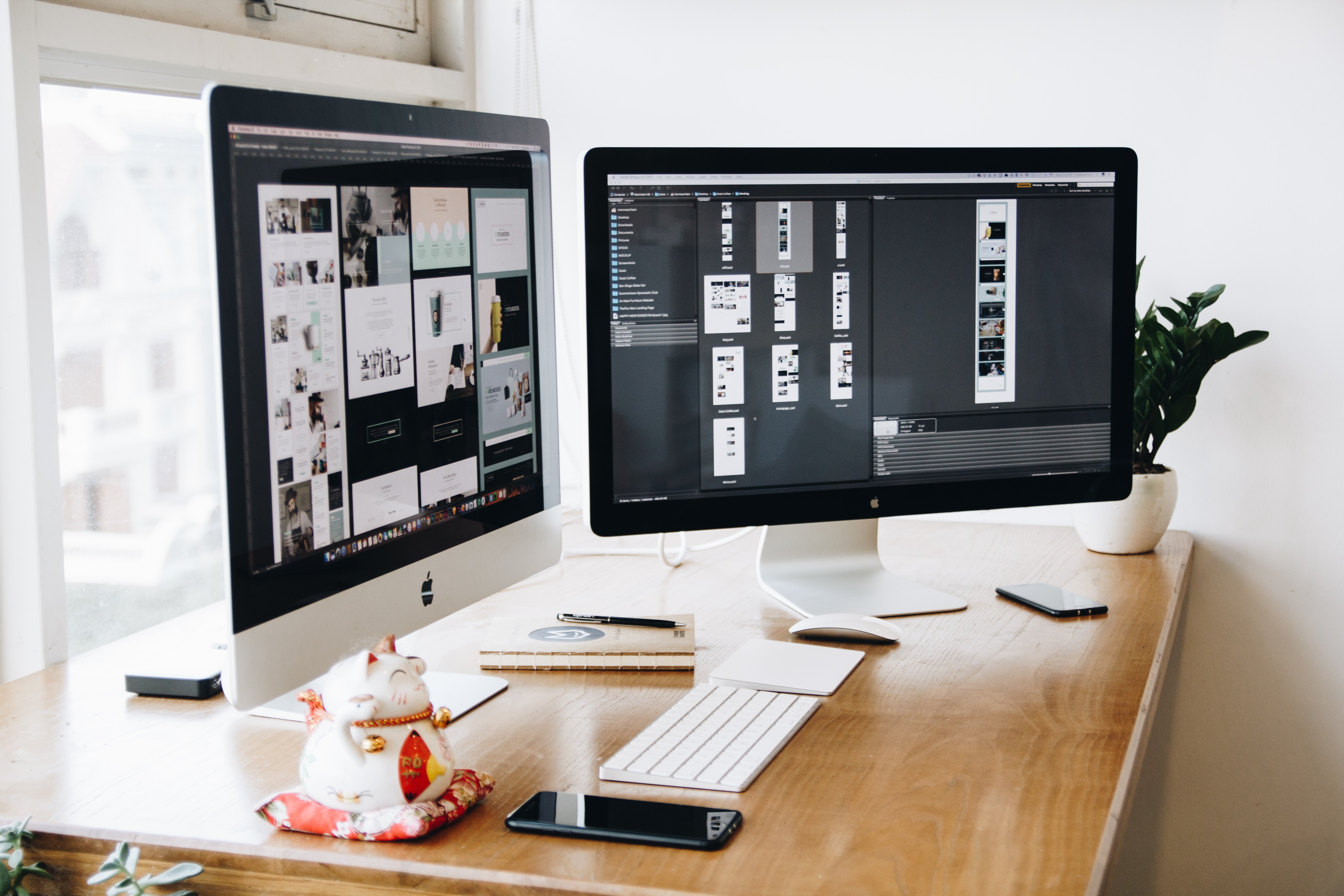
Why are aesthetic websites important?
In today’s very fast-paced world people are no longer taking the time they were once used to when spending time on a website. Most web users today are visually skimming. They are just quickly looking at the website, looking at the pictures, reading the headlines, and maybe catching a few of the calls to action. For this reason, your website needs to look good. Design plays a bigger role than ever today in the success of a business, especially a website.
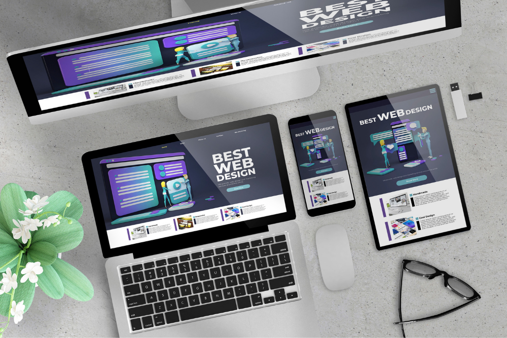
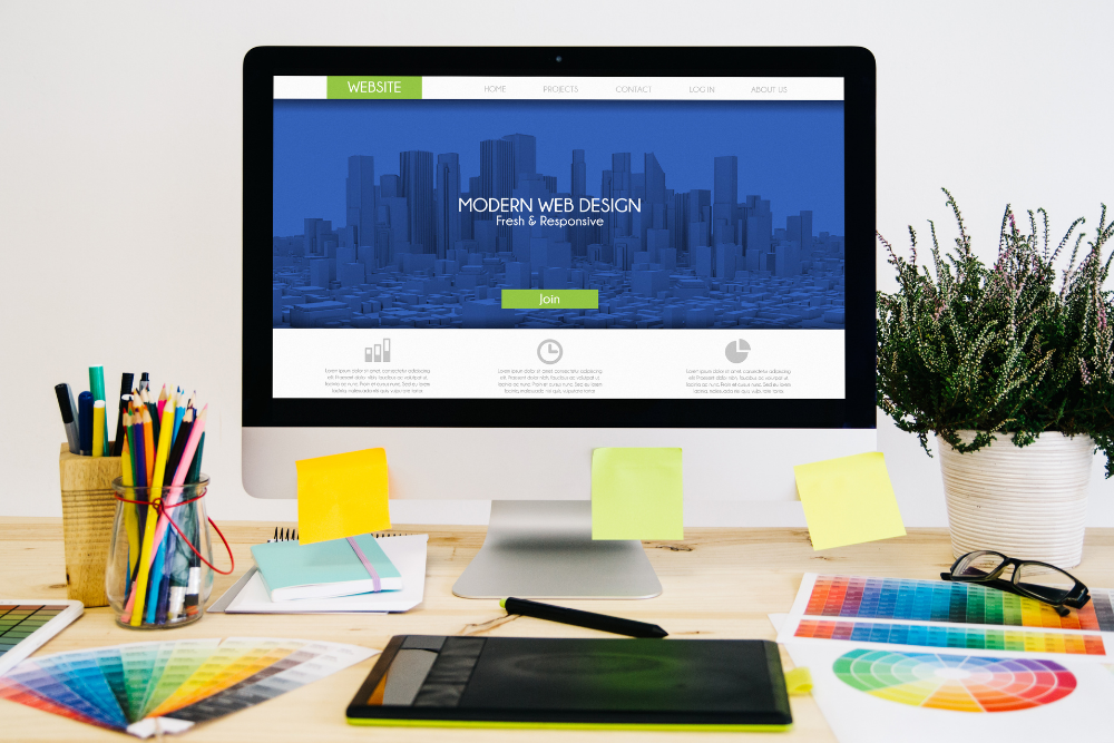
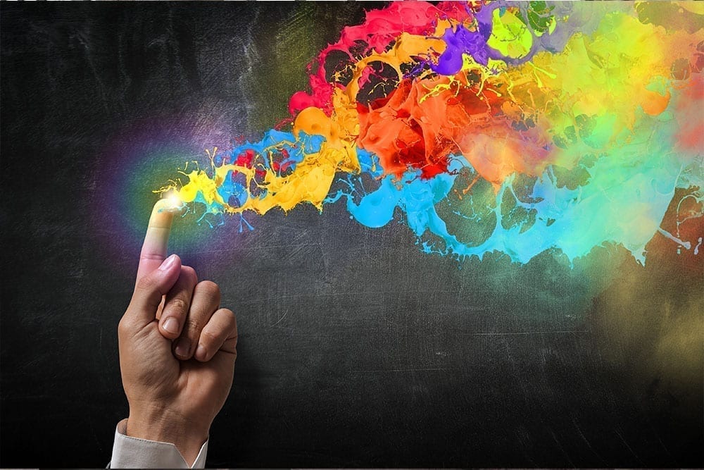
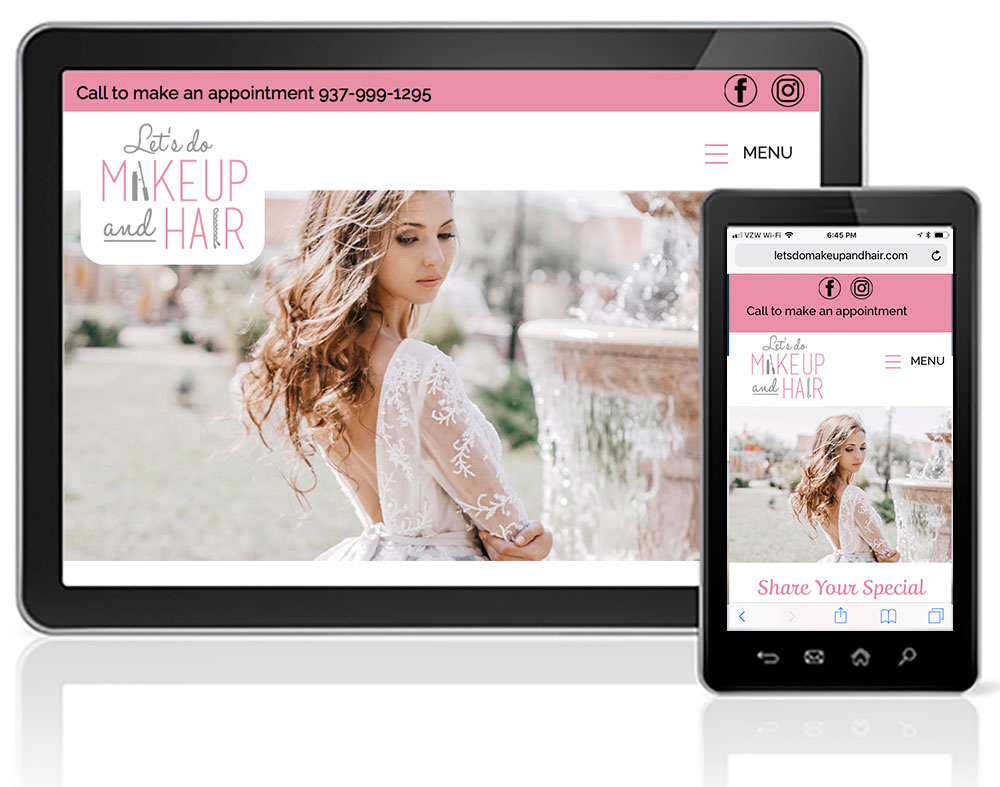
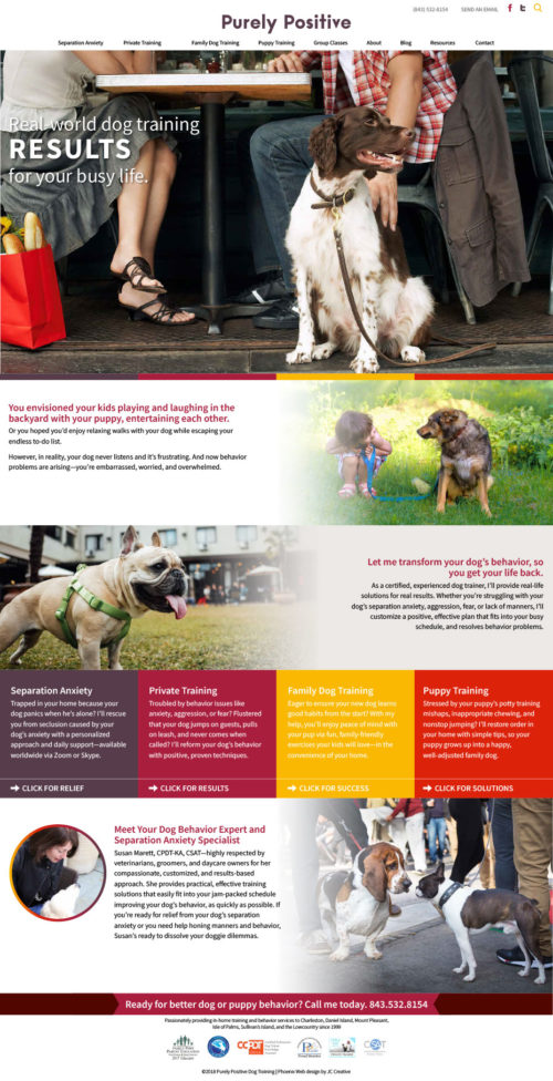
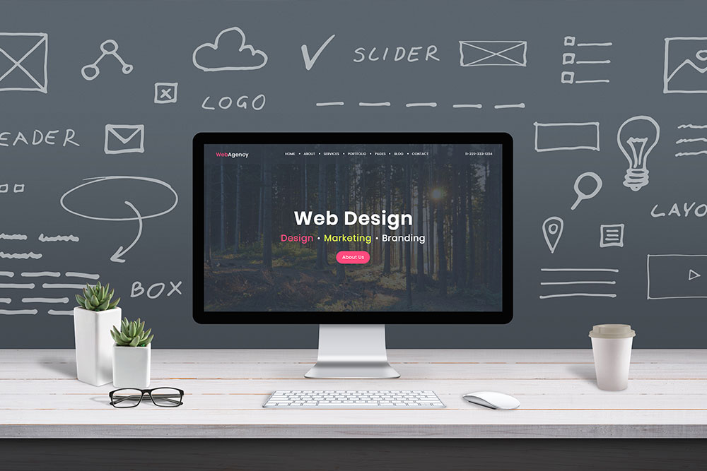
An aesthetic website leans very heavily on visual appeal. When people land on a website design page for the first time, they are more likely to stick around and explore the website if it captures their visual senses than if it is a website that looks outdated and old. A successful aesthetic web design combines a variety of things: fonts, color, images, and layout.
Font choices for aesthetic design
There is a large variety of fonts to choose from when you are considering your aesthetic website design. The easiest thing to do is to visit fonts.google.com. These are fonts that are readily available to load into your website without any extra effort or load time. The nice thing about the Google fonts website is that it allows you to filter your fonts by categories such as san serif, serif, or display fonts. It will also let you filter by how many font weights are available. So, this can make it easier when selecting a font for your website so that you do not have to go through thousands of options.
Color choices
when selecting the palette for your web design, it is wise to stick with the colors that already exist within your brand. After all, your website is an extension of your brand so it should convey the same visual appeal here as it does everywhere else. As a general rule, it’s why aesthetic websites stick with about three colors. You will have your main color, secondary color, and tertiary color. your main color will appear at the highest of the visual hierarchy in places such as H1 headlines or main graphic elements. Your secondary color supports the main color by being an accent in elements such as sub-headlines or graphic accents. The tertiary color will be used more minimally, potentially as highlighted text or possibly buttons.
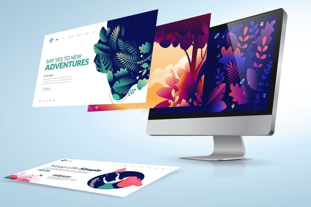
Aesthetically pleasing image choices
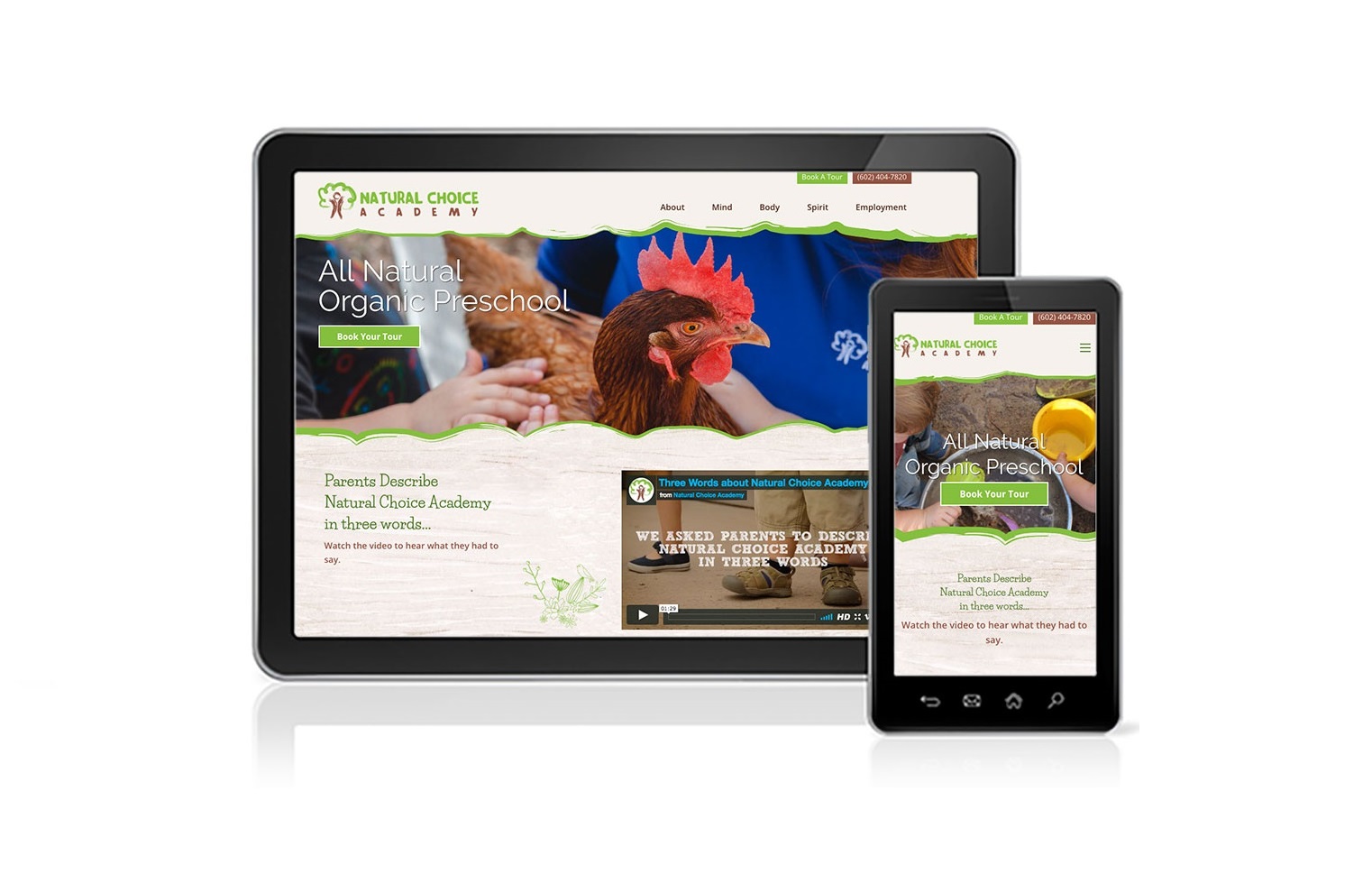
The images that you select for your website design can help paint the picture of the brand or tell the story that you are trying to convey. As an example, a fitness website may highlight very high contrast black and white photos with very high detail on features such as sweat bubbles. Or a fitness website could show very soft images with pastel colors and soft lighting that would tell a very different story of a fitness brand. So, by these two examples, you can see that the images that you choose do make a difference in the visual impact of the branding for your website.
Design your logo, site, & branding material right here for the most visually-appealing package! To keep things fluent and affordable, I offer branding packages to my clients. Packaging your services together with Jen Chapman Creative is the most efficient way to create an aesthetically pleasing website, logo, and more!