
[lwptoc borderColor=”#57c0e8″]
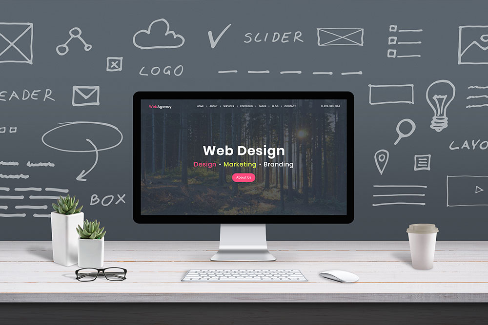
Benefits of using a responsive website design service
With today’s easy access to responsive website design tools, there’s really no reason why you should not have a responsive website. This should be an included element on all website design builds and projects. The list of benefits is really endless, but here are just a few of the top reasons why responsive website design is the way to go.
Google prefers responsive websites
If there is one thing that everybody knows when it comes to websites, It’s that you want to do everything in your power to make your website attractive to Google so that you will be ranked organically in search results. Google has made no secret about the fact that they prefer to rank a responsive website versus one that is not because it is much easier for the user and creates a better experience when browsing online. Google will always rank websites that give a better experience and have great information to back up the keyword that it’s being ranked for. Google also has lots of documentation on the topic here is an example.
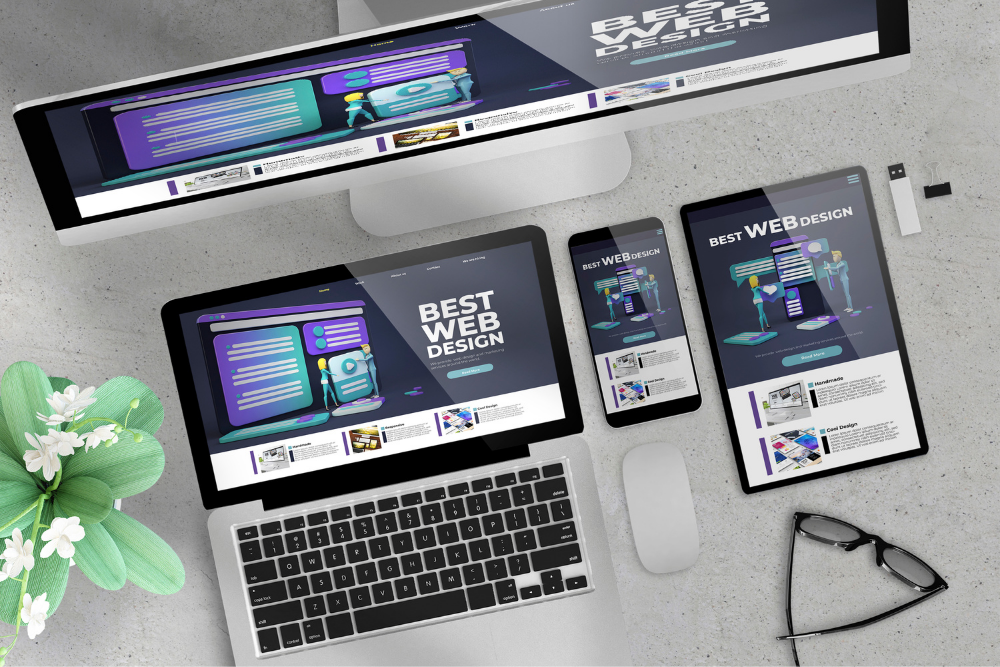
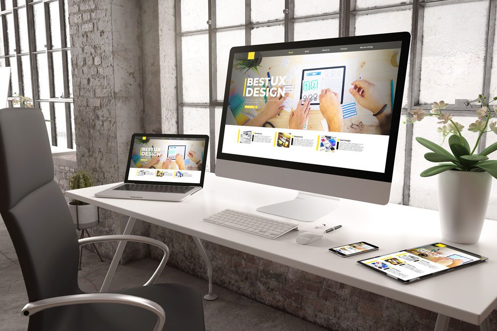
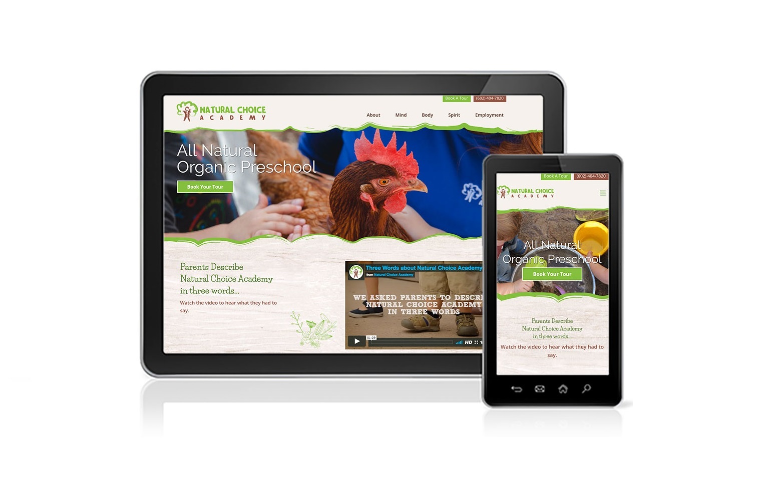
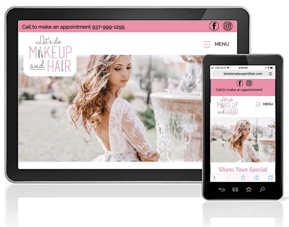
You only have to manage one website
when responsive design was originally released, you had to build out different versions of the website for each one of the resolutions you wanted to optimize for. So, for example, you would build a desktop version, a mobile version, and a tablet version. This was a very cumbersome and laborious way to create websites. Now with more modern technology at our fingertips, we can simply build 1 version of the website and it is coded to look good on all devices by default. This does alleviate a lot of pitfalls from the past, where it was common to have spelling errors or large differentiations in layout due to having to make that same change three or four times
Reduces your load time
as we all know, it is extremely important that your website loads fast. Not only for the user but also to get on the good side of Google. There are many factors that go into making sure that your website is Google-friendly, but beyond having a responsive website you also want to make sure you have a fast-loading website. Only having one version of your website in a responsively built website ensures that you will have a faster load time.
We’re ready to talk about your website design project? Please give me a call at 623-476-7394 or book a call with me anytime here: calendly.com/jenrchapman


