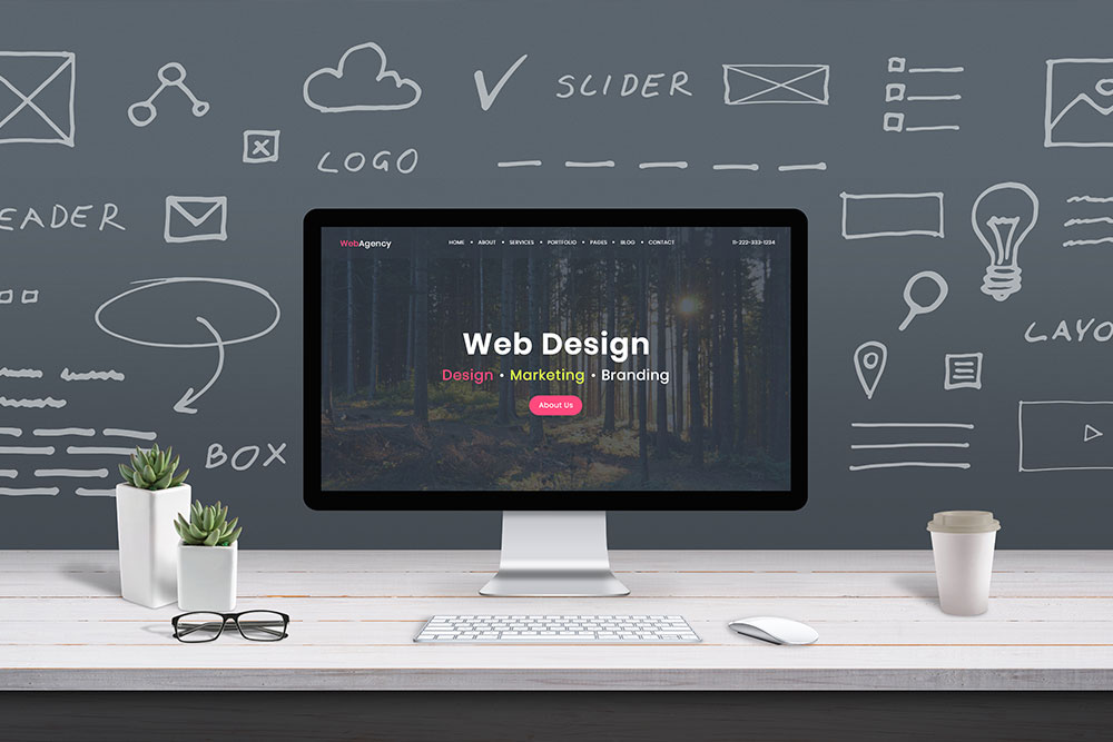
This is a question that every business owner needs to know the answer to. A good website design should engage the viewer and pique their interest enough to stay on the home page more than 30 seconds. It should also be interesting enough to get the viewer to move past the homepage and dive deeper into the website design. This relates to your bounce rate which is important, and we will get to later. When designing a website, there are many factors that should be considered. Some of those include usability, aesthetics, functionality, color, navigation, and simplicity. Let’s dive right in and get to the nitty gritty.
[lwptoc borderColor=”#57c0e8″]
Website purpose
What is the key reason why you want a website for your business? Is it because you want to inform the user about a specific topic? Or perhaps sell your product using an E Commerce platform such as WordPress or Shopify? Maybe you are wanting people to book appointments or phone calls. This and other reasons must be considered when you are designing your website.
Leads
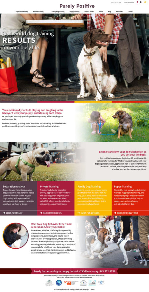
If the intent of your website is to gain more website leads via phone calls or contact submission forms, there are a few tips that I can share with you. First, you want to have multiple call to action buttons that ask or invite the user to fill out your form or call you. What you want to do is spread these out not only throughout the home page but throughout the rest of the site. Perhaps there is a fixed place on the website where the contact form always appears. For example, it could be at the bottom of the website right above the footer or it could be in a sidebar. When you create a consistent place for a call to action area to appear, you make it very easy for that action to be completed by the viewer. You want to make it easy for the user to do what you are asking them to do. One thing to note, which may seem obvious is to make sure your contact form works! Some email clients will block contact submission forms which means you actually never get them! This can cause a real problem for your communication between you and a potential lead. When somebody submits a contact form and they never get a response, they will just move on to the next business that offers the same services. The last thing you want to do is give your competition a lead that could have been yours. So, when you launch your website make sure to test your contact form a few times to make sure that you are getting all of your email submissions.
E Commerce
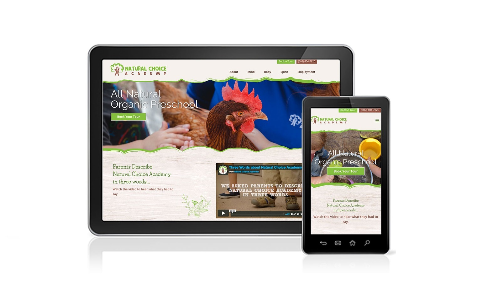
If you have a product to sell online, making the website easy to use is of the utmost importance. You want to have very clear navigation as well as descriptions and photos of your product or products. Having good photography is extremely important. It is not recommended that you take pictures with your smartphone. Many times, these turn out to be dark or lacking in detail. If your budget will allow it, hire a professional to do this job for you. If you have bad product photography, the viewer of the website may get a bad impression of your product and not necessarily be interested in buying what you are selling. You want to have professional product photography that is clean, clear and beautiful. So, whatever you do, do not cheap out on your product photography. Also, make sure that you have multiple views and lifestyle shots with your product if possible.
Graphics & Visuals
It should not surprise you that good design helps sell anything whether that be through package design, advertising or your website. If you think about some of the most successful brands that you interact with on a regular basis, consider how they are positioning themselves in regard to their package design, website design and branding. What are some of the factors that stand out to you in regard to how they have positioned their brand? Could you use any of those tactics as something that you apply to your own branding? It is no secret that today’s consumer expects a clean modern design from every brand that they interact with. I think that we all know that Apple set the bar for this.
Nothing is going to get your potential customers to leave sooner than an outdated, old looking website that was done in HTML eight years ago. When you are considering what the graphics and imagery should be for your site, here are a few things for you to consider:
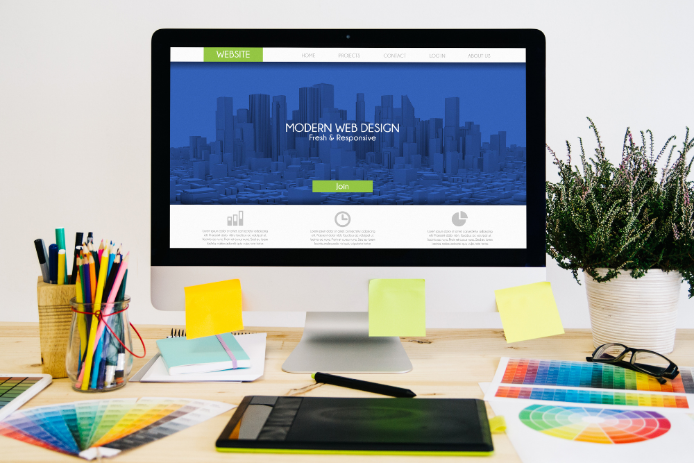
Color Selection
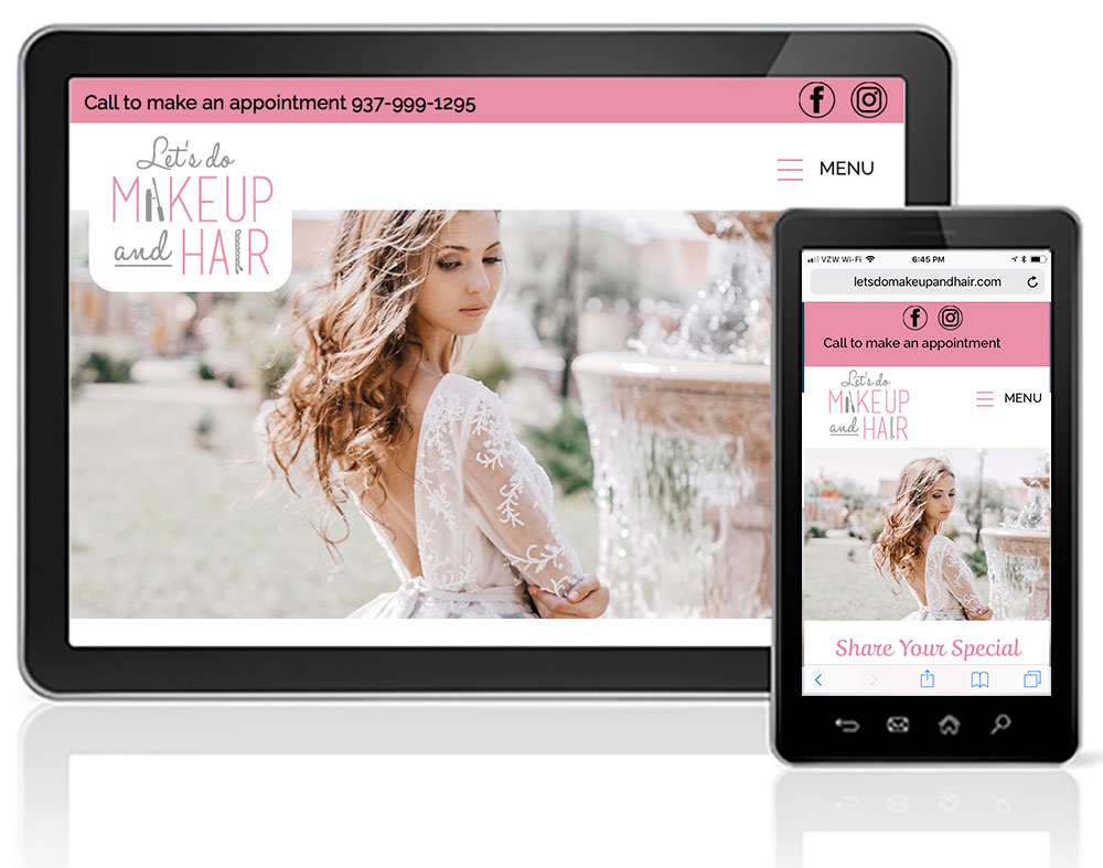
Your color palette is a representation of your brand. Many times, your color palette is directly derived from your logo. While you may only have one or two colors in your logo, you may want to consider having a supporting color palette that coordinates nicely with your logo design. If the main color in your logo is orange, then orange should be the primary color that is used throughout your website design. This may appear in things like your headlines, color bars with important information, or a fun design trick is to select photography that has that color as a primary hue that appears in each of your photos. Then you will have a secondary color. Let’s pretend for a moment that color is blue, which is a compliment to orange. You will want to use blue as an accent color in your website. This could appear in items like buttons, accentuated statements or sentences, or smaller design elements like social media icons. When your web design is complete, take a step back and look at the website as a whole period does it cohesively hold together as a color coordinated website, in order to create consistency and flow it should.
Typography
Many people underestimate the value of a good font. Fonts can help evoke emotions such as cheer, caring, or trust. It is a good rule of thumb to use at least two fonts but no more than three fonts in your website. The first font may be your accent font. For example, you may have a script font that you use for all of your headlines in branding statements. This particular font may have a lot of personality and irregularities that give it that human handwritten type of feel. The second font you use may be a clean, modern sans serif font that you use for all of your body copy and secondary headlines. It’s possible that you may have a third font that you use very sparingly on items such as your buttons. Just make sure to not overdo it because you do not want to use so many fonts in your website design that it starts to look like a third grader built it.
Quick tip: When selecting your website design fonts, check out fonts.google.com for some options beyond your standard times new roman or Helvetica.
Imagery
The photography that you select for your website can set the overall tone for your website. Let’s use a law firm as an example. Traditionally speaking, law firms tend to be very corporate and serious in nature. This gives the customer the feeling that the lawful firm is trustworthy and professional in what they do. You don’t want to work with a law firm that looks like everything is a joke because it is likely that whatever your case is, it is serious and needs the utmost attention.
It is always best practice to have your own photography if possible. Many times, this means a photo shoot of some sort. When you do your own photography, the business tends to feel more personal and approachable. Using photos of employees in the company can create a connection before that first phone call is made. However, the use of stock photography is not uncommon. Many businesses when they’re first starting off do not have a gallery of photos to choose from to use for their website design. Rather, using stock photography that is available for use provides them with the ability to have a professional website to launch their business with. Either option is perfectly acceptable. Keep in mind that a website is always changing and evolving as the business grows. What you do today will be quite different from what you are doing a year from now, and that is OK.
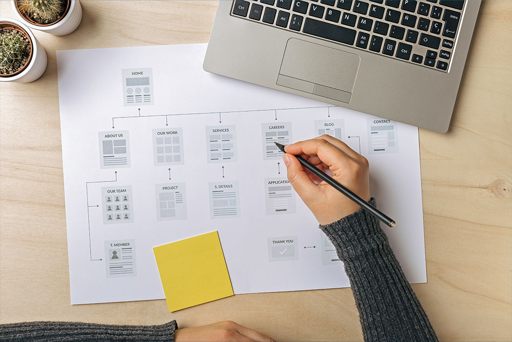
Navigation
it is very important to remember that the navigation of your website should be clean, simple and easy to use. Organize your navigation in a way that is Intuitive to the user. As an example, some pages that may fall under the about tab could be meet the team or FAQ’s. There are some decisions to be made regarding the design of your navigation. You will want to consider whether you want in desktop view for all navigation items to be viewable or if you want to go with a simple mobile menu instead.
Traditional Menu
With the traditional menu design, when you land on your website you will see all main page categories. There may be a dropdown menu for some of those categories. The benefit is that you will never have anybody telling you they can’t find your menu. Some of your older customers I prefer this type of menu design. However, please remember that in mobile view there will always be a mobile menu.
Mobile Menu
The mobile menu is commonly referred to as the “hamburger menu” because it is represented with three lines. When you click this icon, the menu expands to show you all of your options. This tends to be the cleanest look that you can achieve, however there are still going to be some people that do not notice it or recognize it and get stuck on the home page. So, you have to weigh your options and make the best decision for your website design and your brand.
Content
Content is perhaps one of the most important factors when building your website design. Content is and always will be King, at least in Google’s eyes. The reason why your content is so important is because when the Google bots are scanning websites, they read the content on a website to determine what that website is about. The more informative and valuable content that you provide, the higher that Google will rank you. You need to only consider this if you are wanting to be found organically through Google search results. If you are simply creating a website for the purpose of having something up there for potential clients to see and know that you are a real business, you can disregard this advice. There are some websites that really only need to have a presence, in therefore they can be super minimal with their content and their strategy instead is big beautiful visuals and white space.
Having to write your own content can be a daunting task. Many business owners tend to fumble in this area when it comes to writing the content for their website. When I am doing a website design project for a business, I do create a basic outline 2 help with ideas and an overall flow of what that content could or should be. There are, however, some occasions where a business owner is simply too busy to take on an assignment such as this so at that point it is necessary to outsource that work to a content writer or otherwise known as a copywriter. If you are in need of a copywriter, I do have a few sources that I know in trust that I can refer you to.
Page Speed
Having a website that load slowly is a quick way to get a potential client too leave your website before they have even gotten to know you. In today’s fast-paced, modern world, instant gratification is everything. The majority of the users today are browsing web sites on their mobile phone. An ideal website will load on a mobile phone within about two to three seconds.
Page speed is also important when considering your rankings with Google. Google has high expectations on website page speed and optimization. You can use the Google PageSpeed insights tool in order to get an idea of where your website is ranking currently. Keep in mind however, that the page speed insights tool is very critical in getting a high score in the green workings is very difficult. You basically want to do the best that you can in order to have a slick and fast loading website that is still visually appealing. Having a fast loading website can increase pageviews, increase conversions, and lower your bounce rate.
Speaking of bounce rate, now is the time to talk about this. Your website design bounce rate measures how many people go to your website in view the home page only then leave versus the amount of people that go to your website and view multiple pages. It is ideal to have a bounce rate as low as possible. If you have a high bounce rate, it is possible that your website is either attracting the wrong type of client or a more likely scenario is that your website is not interesting or engaging enough for them to stick around. Either way, you will want to fix this as soon as you can because this is another factor that Google uses to determine the authority that your website has in your competitive space.
Authenticity
Something that you want to remember when writing the content of your website is to be real and to be yourself. Try to avoid fancy talk or speaking in a tone or in terms that your audience may not understand. While you may think that you are impressing them with your big vocabulary words, you are actually creating a barrier between you and your potential client by making them feel like they have no idea what you are talking about. One of the things that many people tell me when they visit my own website is that they like how clear and to the point I am. I do not try to use fancy agency or designer talk. Everything that I write I put in clear and simple terms that everyone can understand. I do not think it is necessary for people to have to weed through a bunch of fluff in order to get to the point. Make sure to inject some personality into those sentences! Give your reader a sense of who you are, your sense of humor and how and why you can help them. This is another area where your own photography helps to sell your story a little better than using stock photography.
In summary
When it comes to Phoenix website design and development, I am here for you. Designing and building a website is a big task and you should not have to do it alone. Consulting with a website design expert can relieve that burden and turn the project from a feeling of dread to a fun and exciting process. Call me anytime at 623-476-7394 or you can book a call with me here: calendly.com/jenrchapman.